An unexpected B2B event.
For LinkedIn’s inaugural B2Believe conference they wanted to create something unexpected. To defy the conventions and expectations of B2B marketing, inspiring their audience and propelling the industry forward.
For this task they tapped Tool as their lead creative partner to bring a cohesive creative approach and craft to the event, helping them challenge the notion that B2B has to be boring.
The Opportunity
The conference was separated into 2 days. Day one was the first year of B2Believe, an event engaging a broad B2B marketing audience. The second day was the 12th year of PartnerConnect, focusing on a smaller group of key LinkedIn Partners.
This presented a unique opportunity to establish the basis of a new conference, while also leveraging the historical approach of Partner Connect.
A Cohesive Design Language
Early on in the project we identified three core themes to deliver upon:
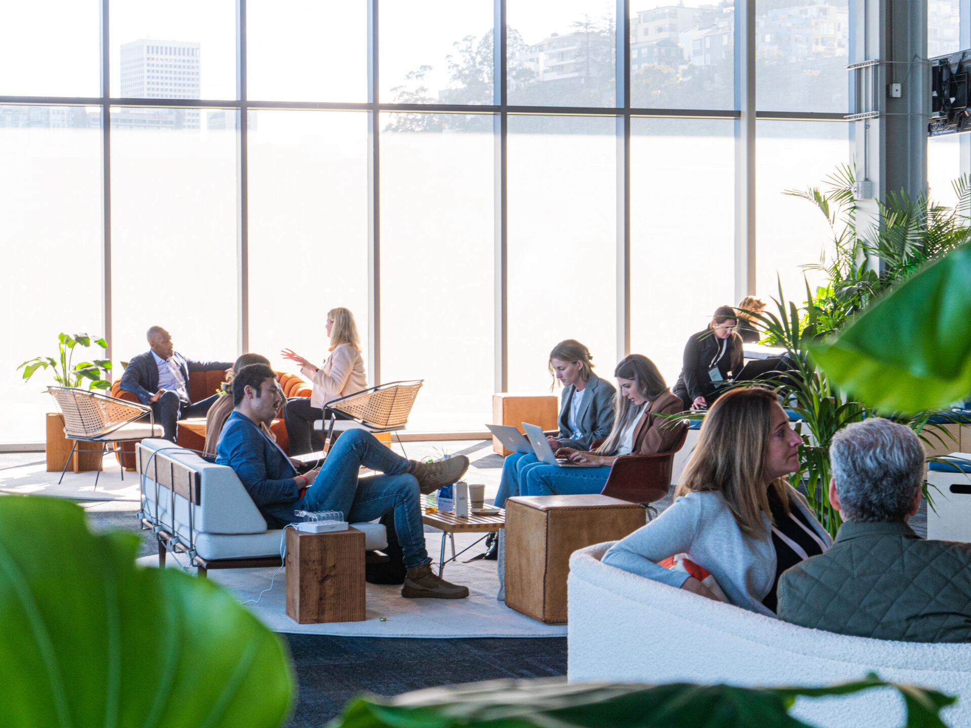
Connect the B2B community
Inspire them to approach B2B marking more creatively
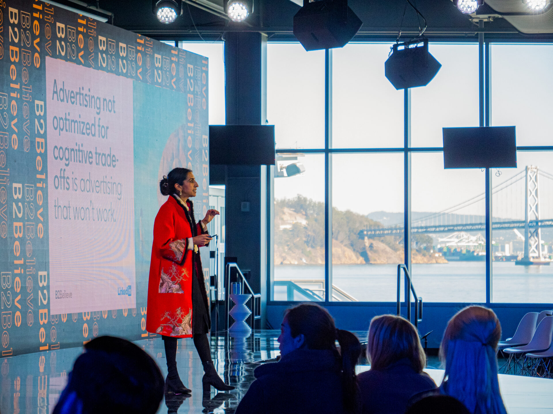
Celebrate the accomplishments of the community
Every touchpoint of the event was considered against these key themes to create a cohesive and functional event.
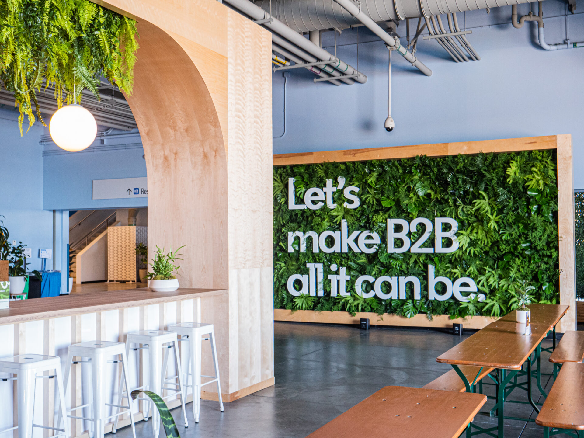
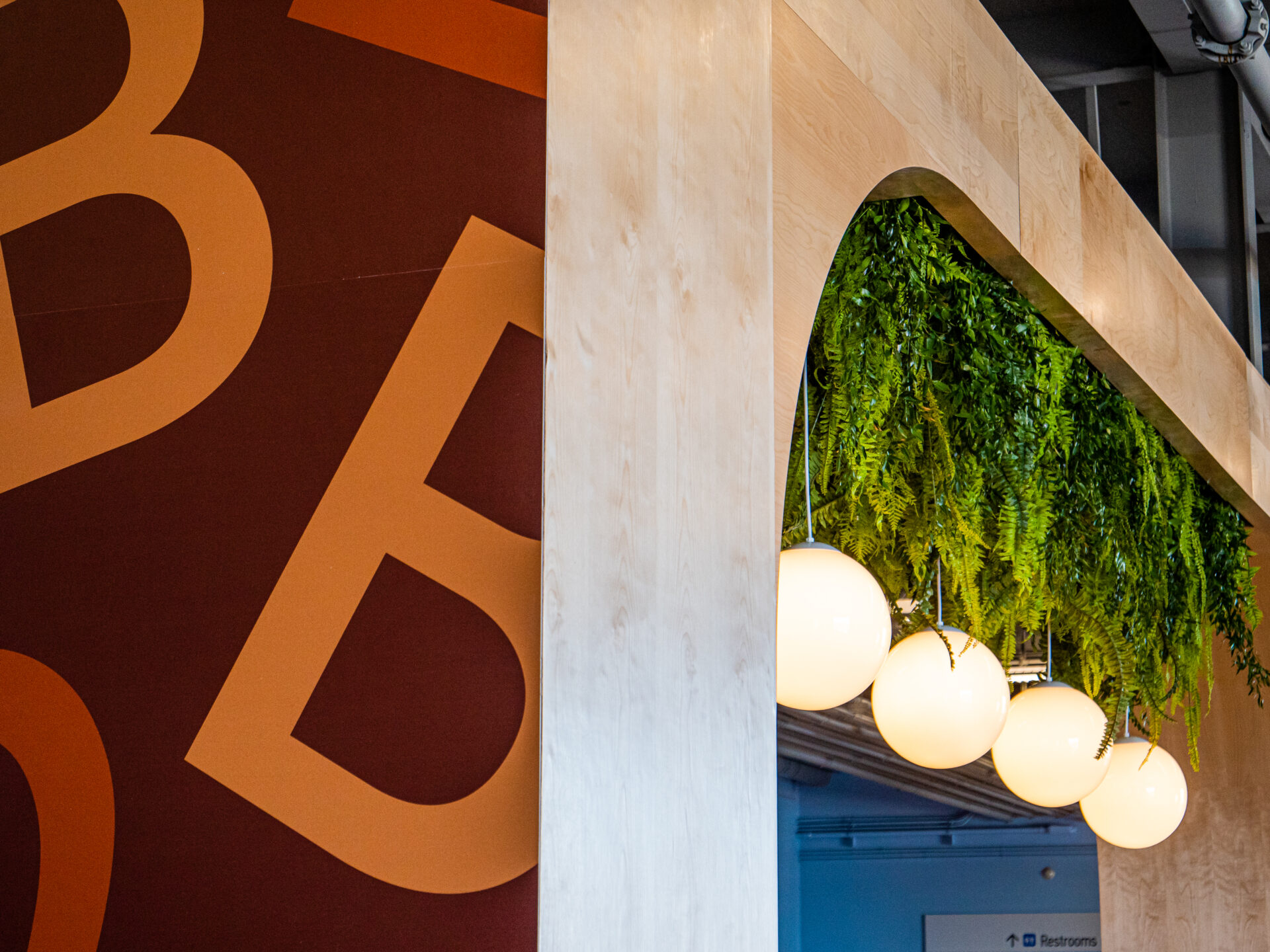
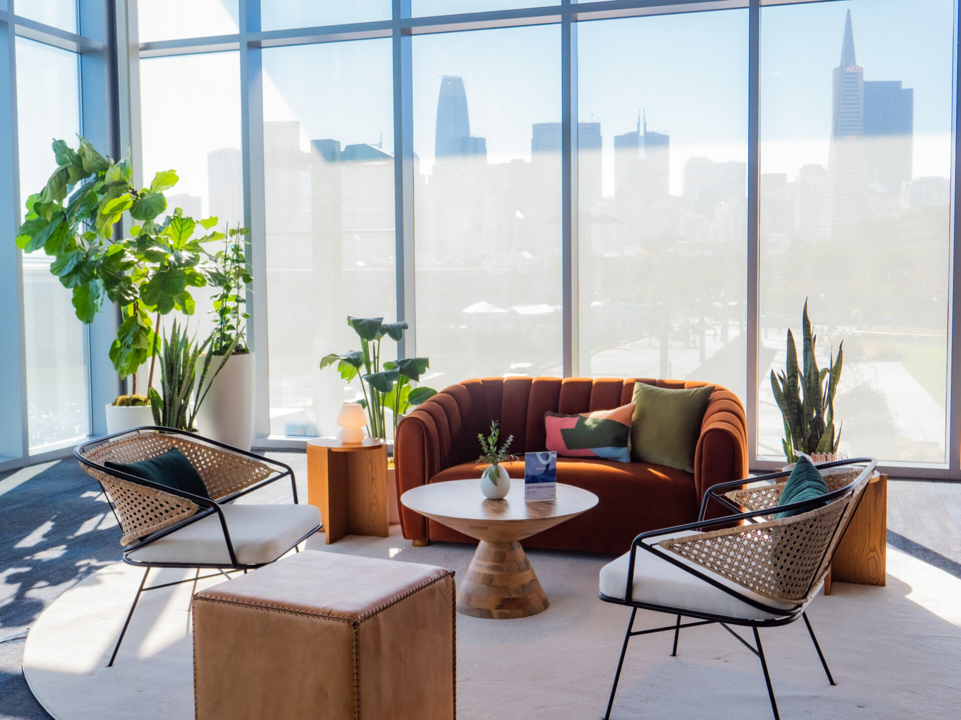
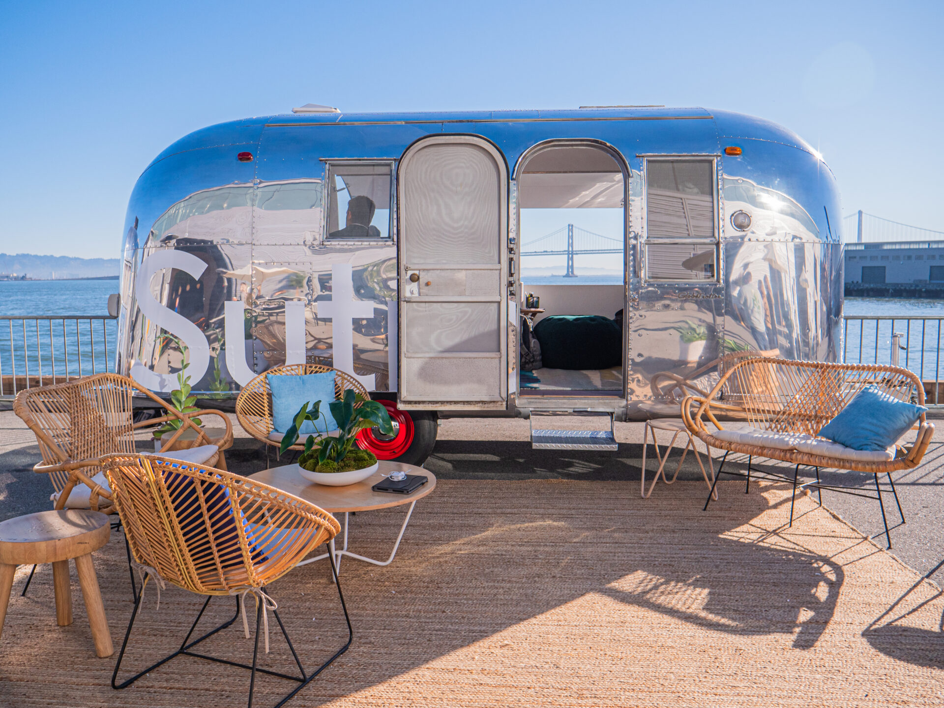
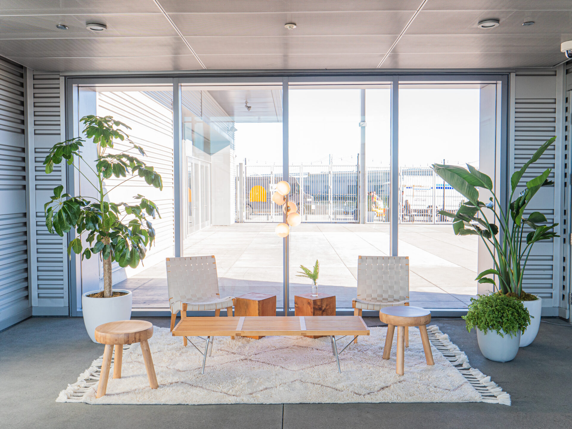
A design language was created that extended to everything from print pieces to motion graphics to furniture, decorations and set pieces to create a unified and considered experience. The design started with LinkedIn’s base brand colors, textures, and principle of simplicity. The goal was to create something that felt clear, simple, and functional, making a large space easy to understand and navigate. Each design decision also considered the core themes of connecting, inspiring, and celebrating. Key to the approach was leveraging the natural beauty of Pier 27 in SF and leaning into comfortable yet inspiring textures like natural wood, greenery, and natural light.
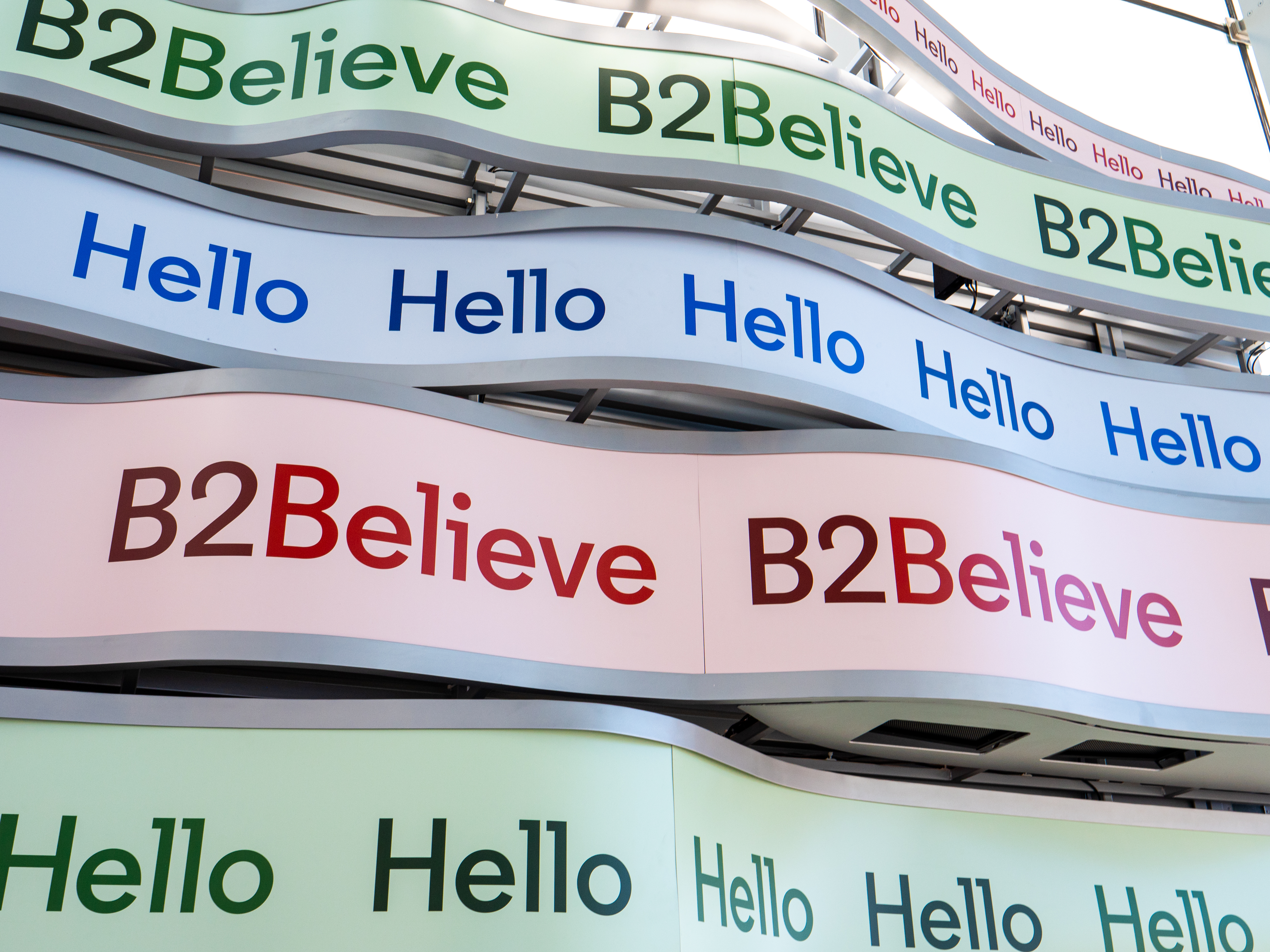
Attendee Journey
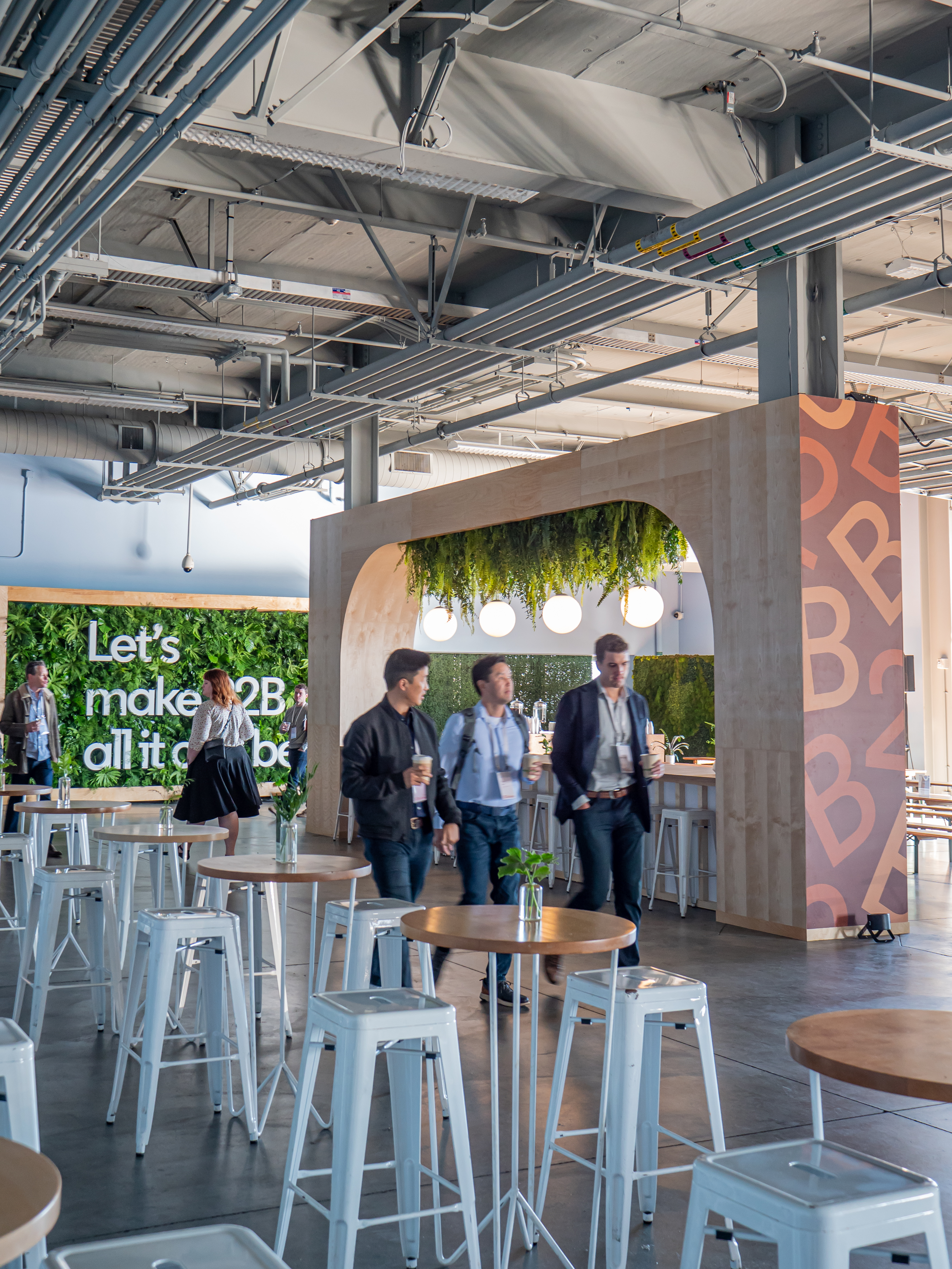
The attendee journey was highly considered.
Due to the scale and layout of the space, a clear and simple journey was necessary. In addition each touchpoint was considered against the specific intent based on the key themes of connection, inspiration, and celebration. Each area was designed to accomplish one or more of these core themes.
Production Design
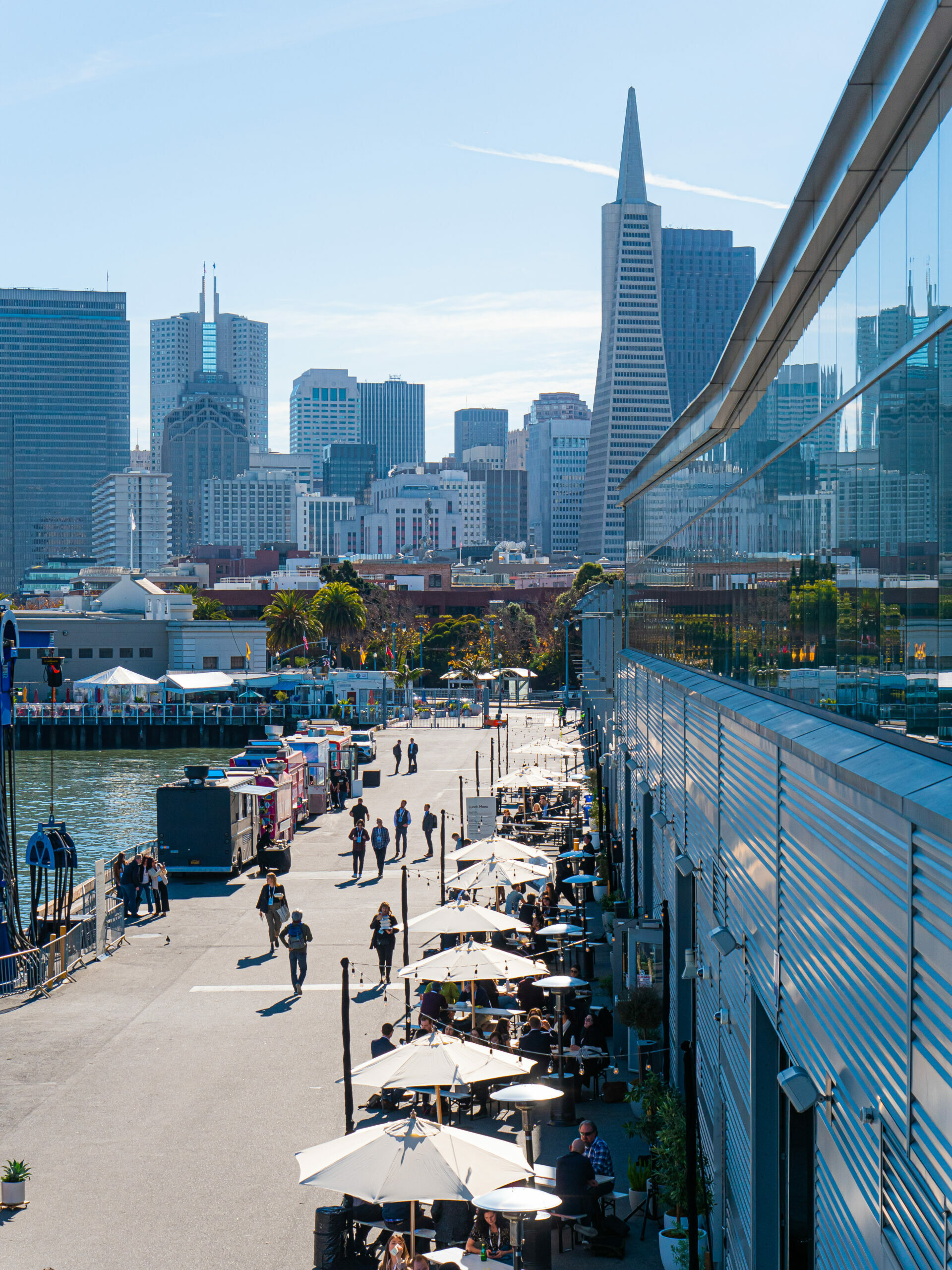
The event was held at Pier 27 in San Francisco.
A large space with a beautiful view, but also a very utilitarian terminal space. Our task was to transform this space into one that embraces our key themes. We wanted to embrace the beautiful views of the bay by keeping an open floor plan and low profile furniture.
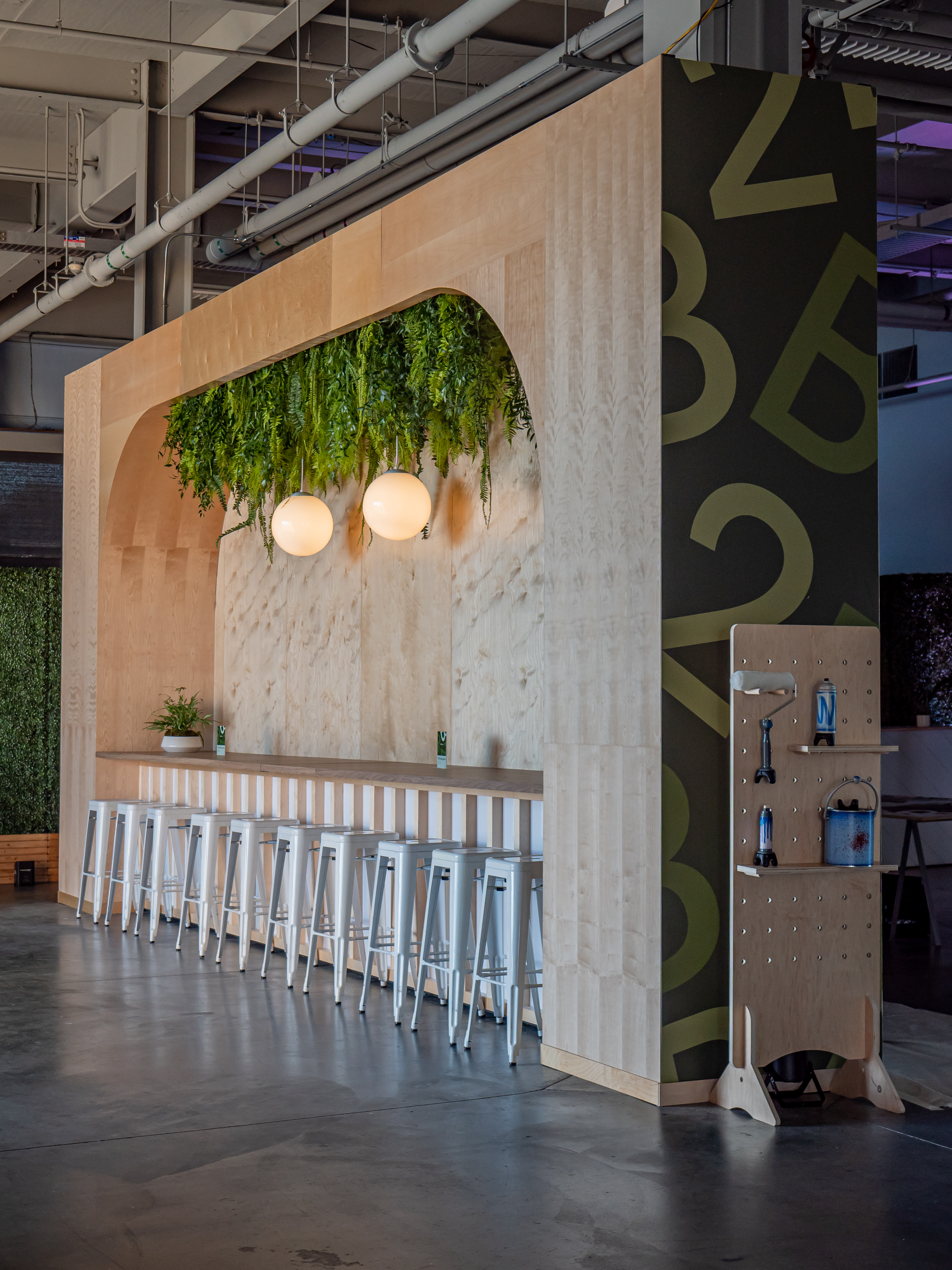
Custom structures were built to create an inspiring and inviting space.
Large amounts of bespoke furniture were designed and built to transform large open areas into community building spaces. The space was finished off with lounge pods for smaller groups to converge.
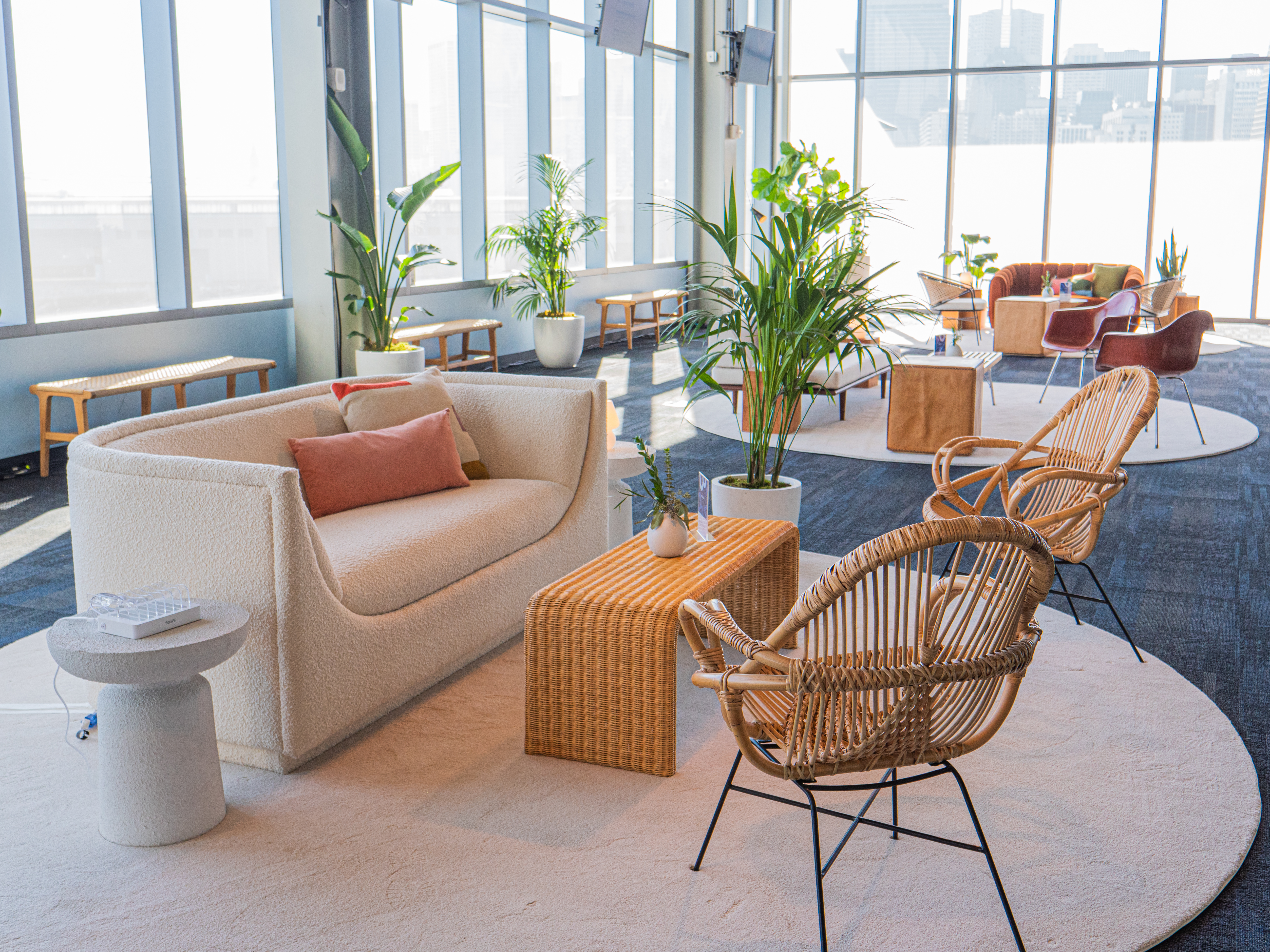
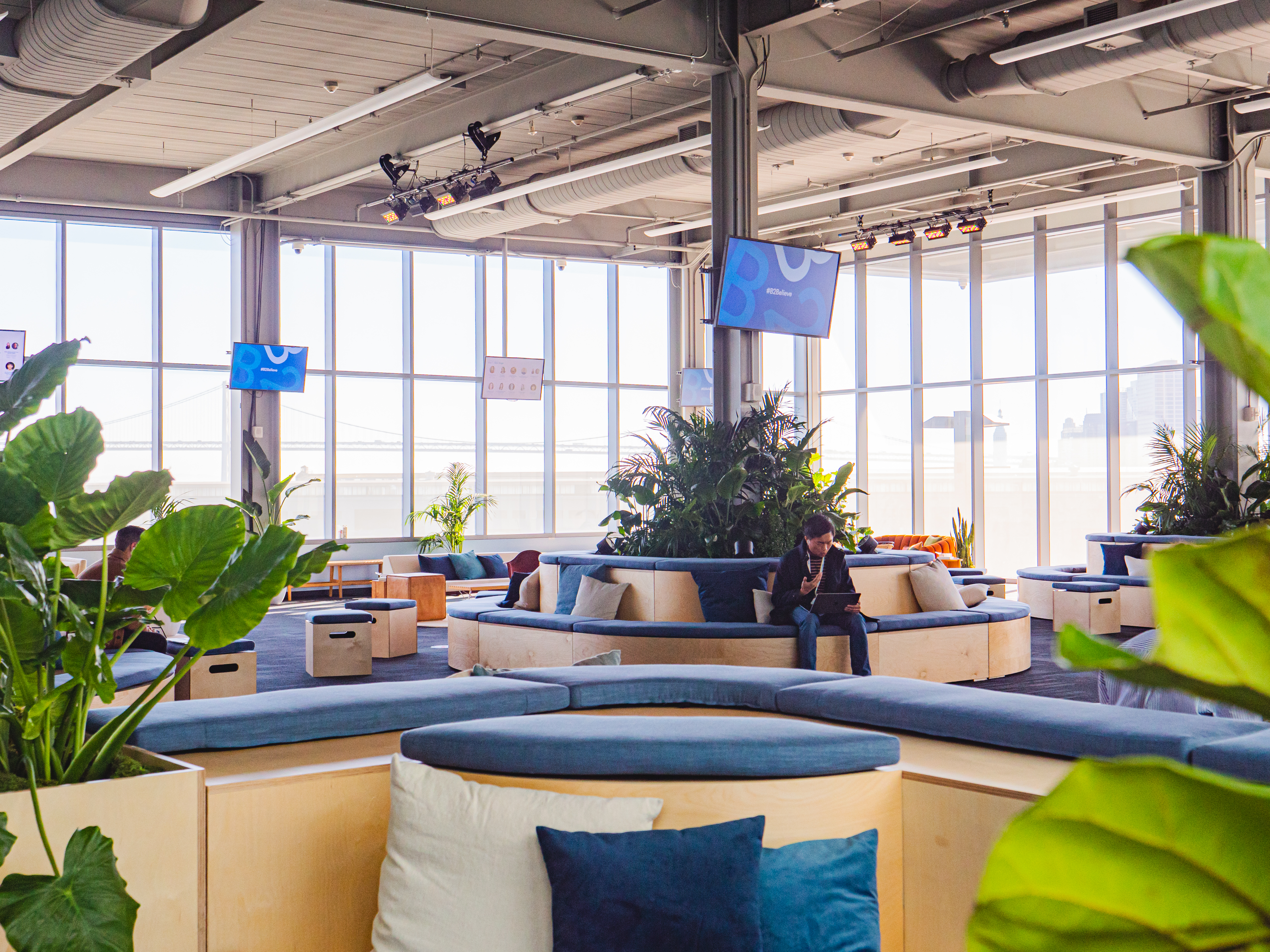
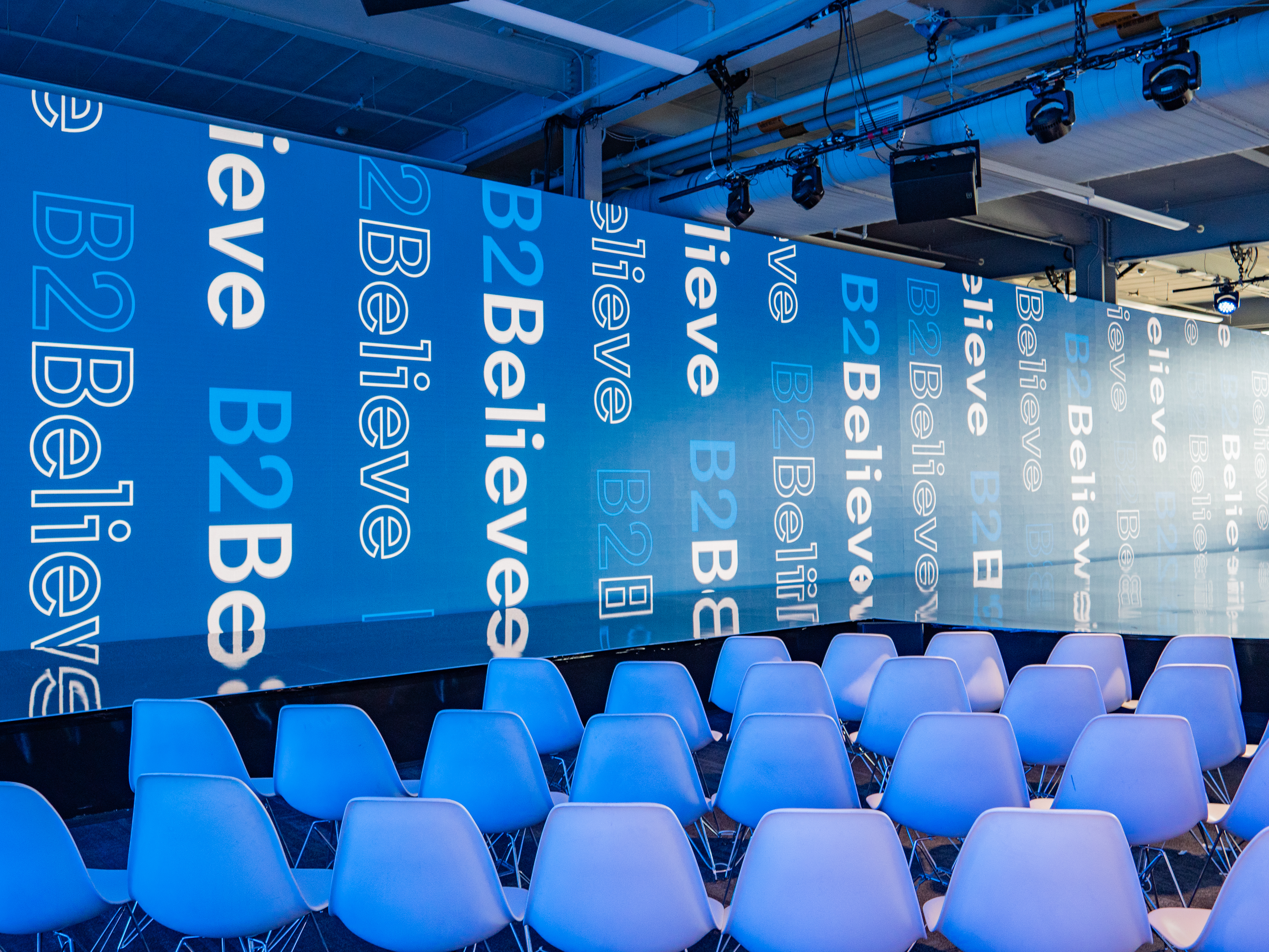
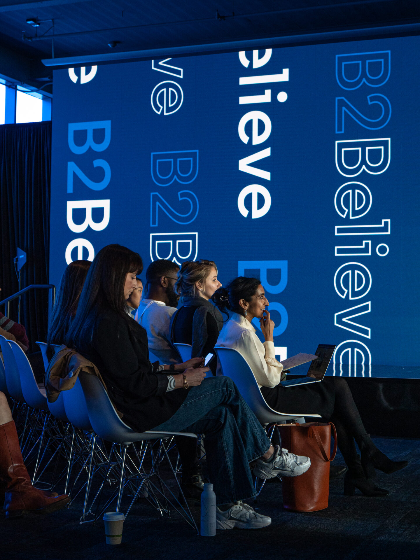
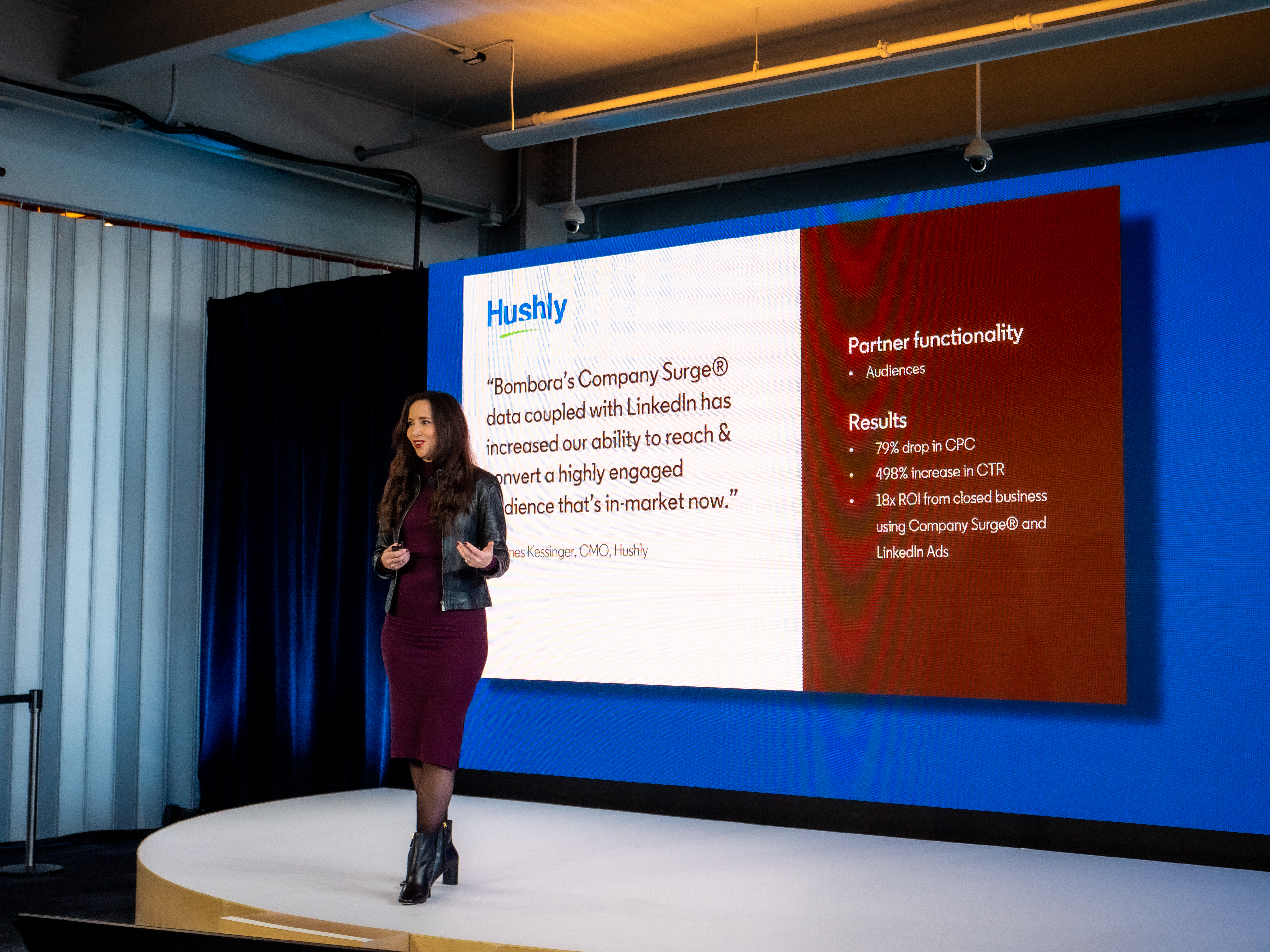
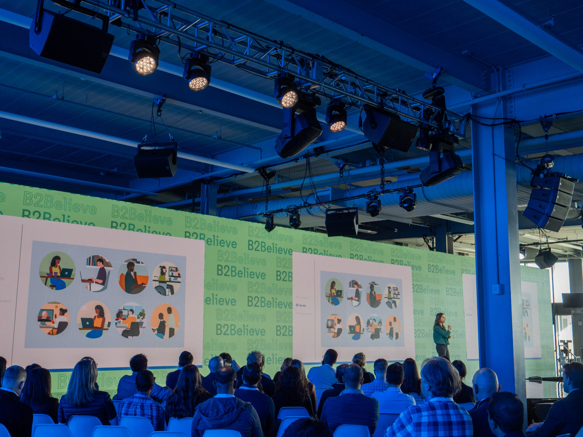
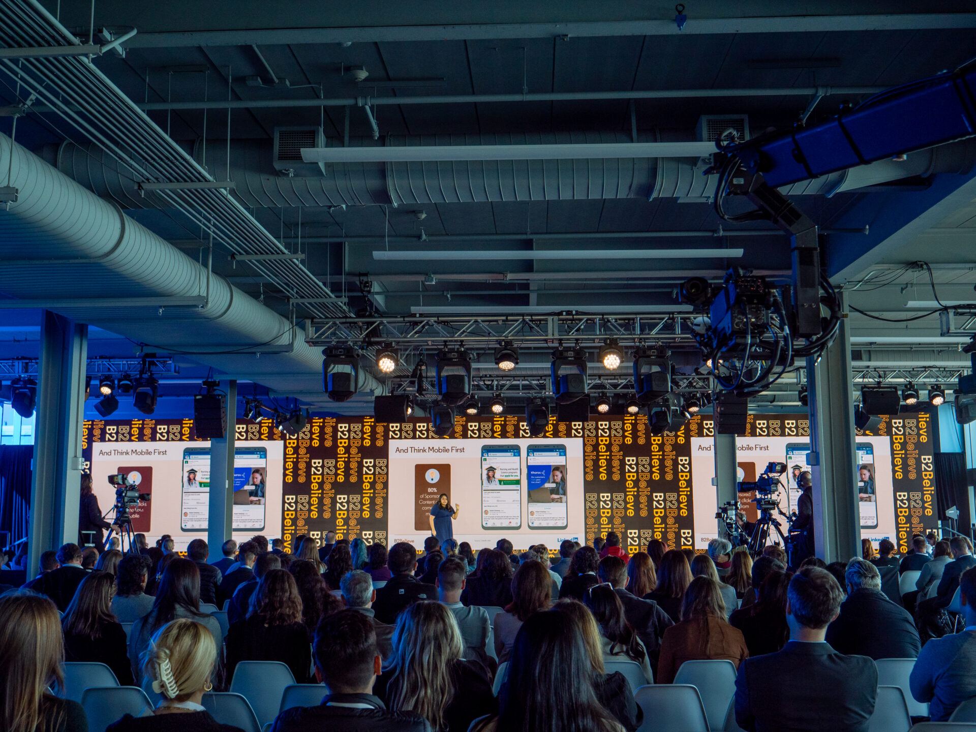
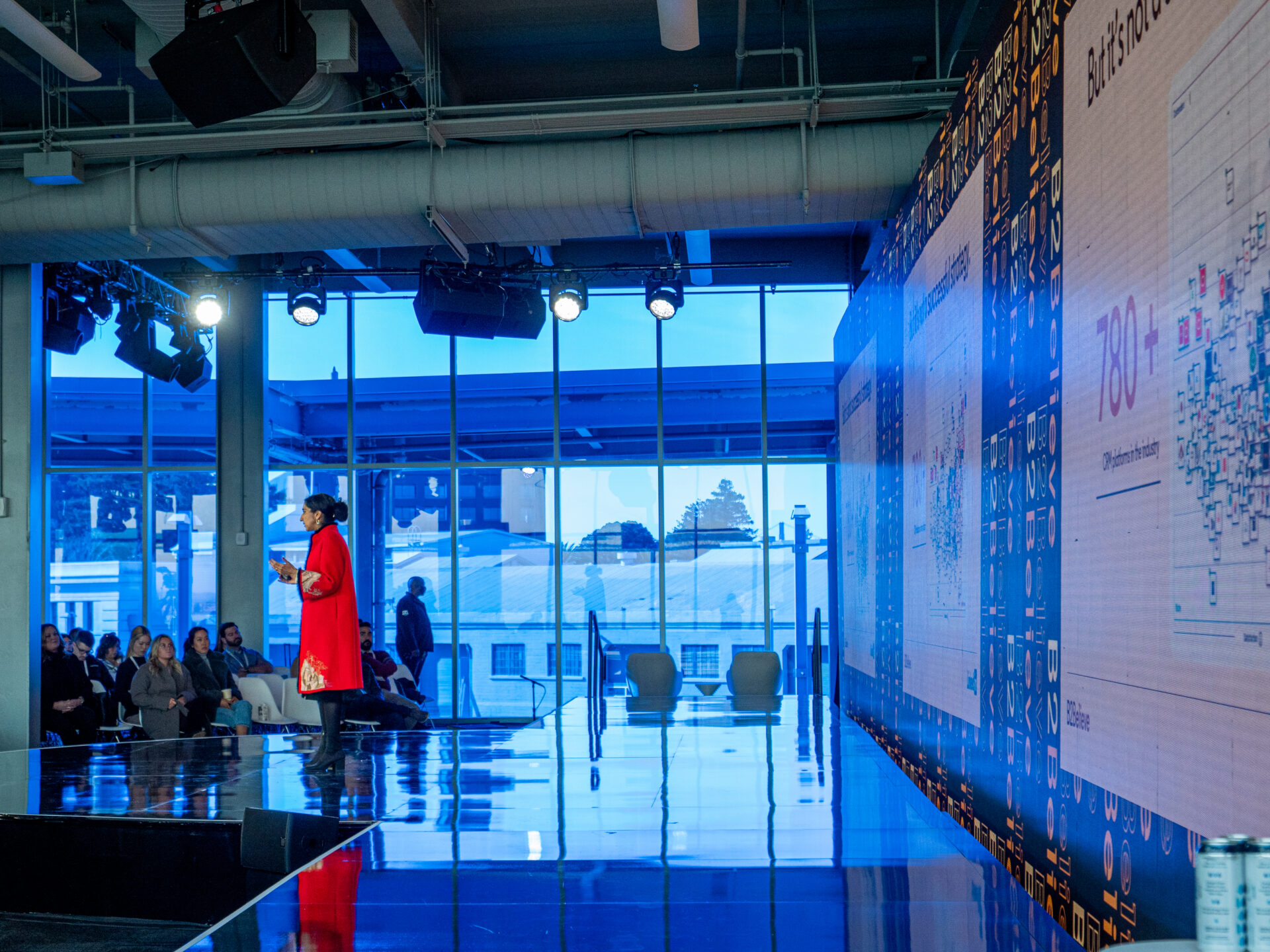
The main stage was a custom built oversized screen stretching nearly the width of the conference space.
The intent was to create larger than life messaging reinforcing the importance of the messages within the keynotes. Reflective stage surfaces and adaptive audience lighting were used to create a more immersive experience bringing the attendees into the keynotes.
Motion Graphics Package
A motion graphics package was created to be utilized in a realtime broadcast system for both the in person experience and online streaming.
Due to the nature of the space, the extreme scale of the screen, and the structural elements that were unavoidable, a lot of unique elements had to be considered. The graphics had to be clearly viewable from multiple angles, easily converted to a standard 16:9 format, and utilize an appropriately subtle motion to avoid being overwhelming on the large screen. Additionally full scale moments were created for key moments like the pre/post show graphics, and host introductions.

Creating Micro-Engagements
A key goal of the conference was to unlock the creativity within each of our attendees.
To accomplish this we created a couple collaborative, disruptive, creative engagements.
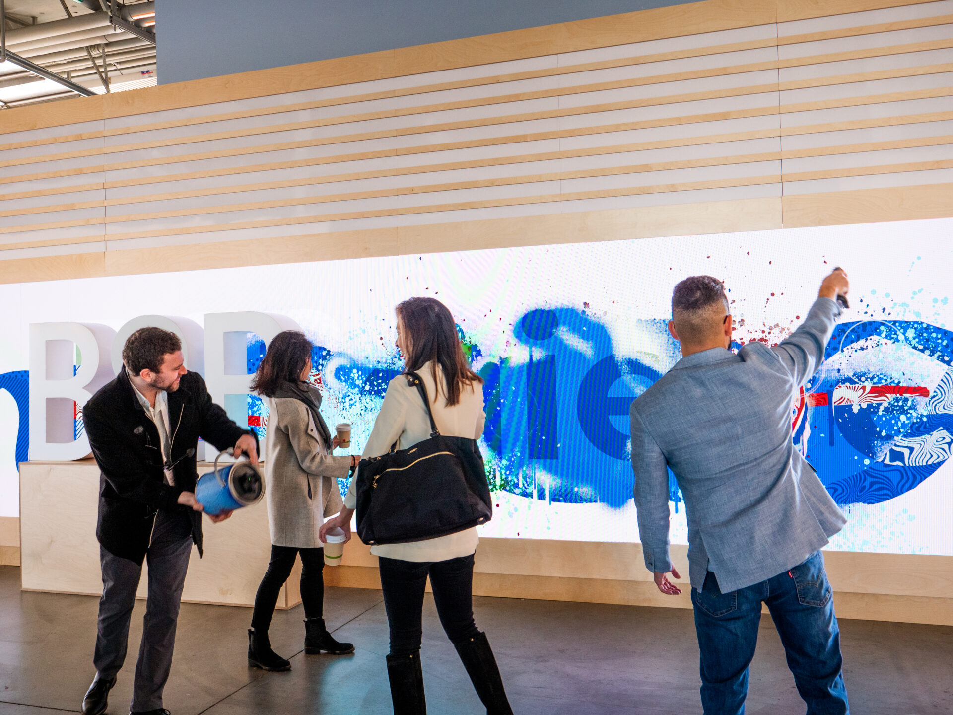
Digital Graffiti Wall
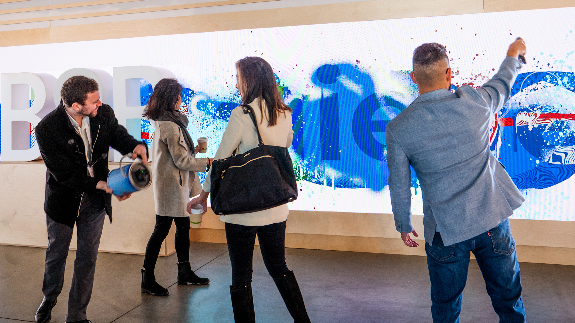
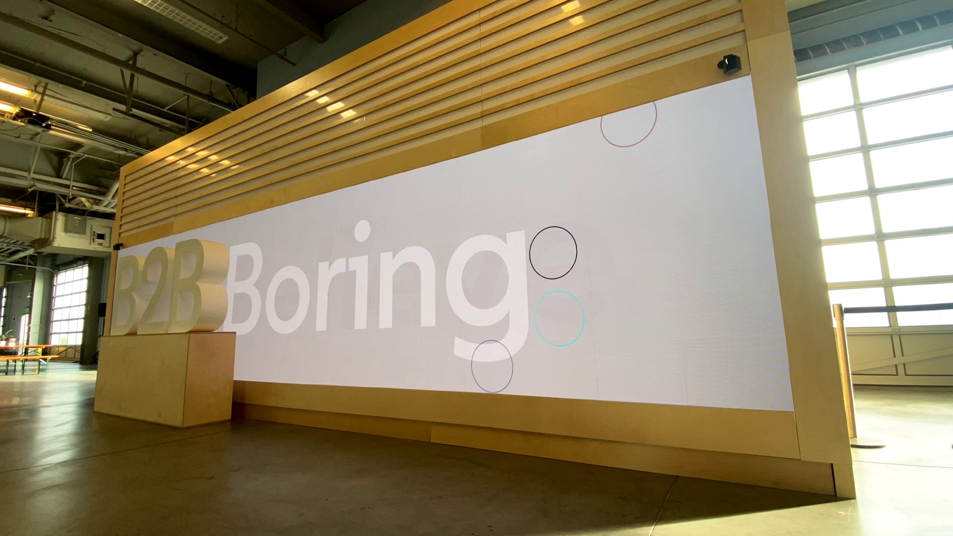
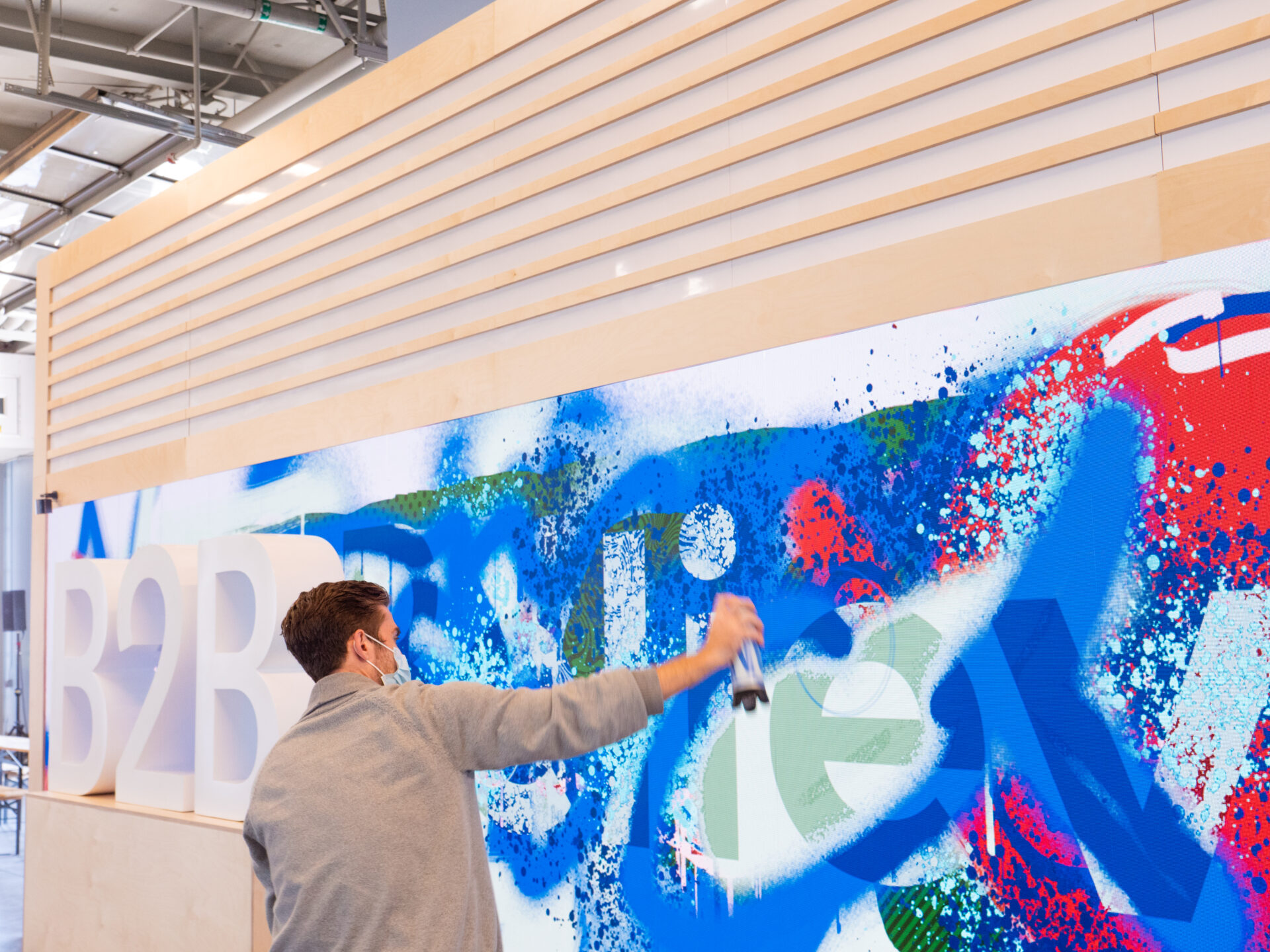
A prominent installation was an interactive LED that allowed attendees to collectively transform something that begins bland and literally says “boring” to something that was beautiful and expressive. A blend between creative tech and physical installation, this was meant to inspire and create a magical moment.
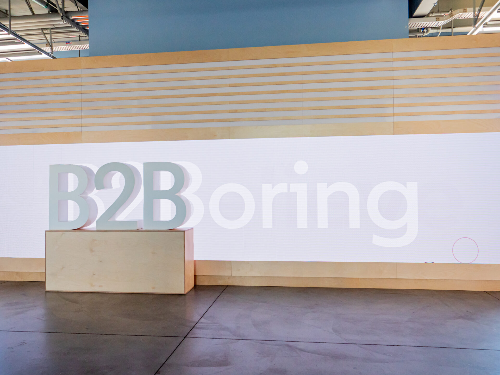
The board started out as a bland white on white that said “B2Boring”. Through the use of multiple digital painting tools participants were able to deface the expected and create something unique.
As the screen was augmented it would change from “B2Boring” to “B2Believe”. The experience was designed to be fun, expressive, and intuitive while having the range to create infinite pieces of collaborative digital art.
Creative Tech
We used the HTC Vive Pro 2 headset and base stations together with five Vive 3.0 trackers to create the technical setup and integrate seamlessly with our custom developed software, made in Unity.
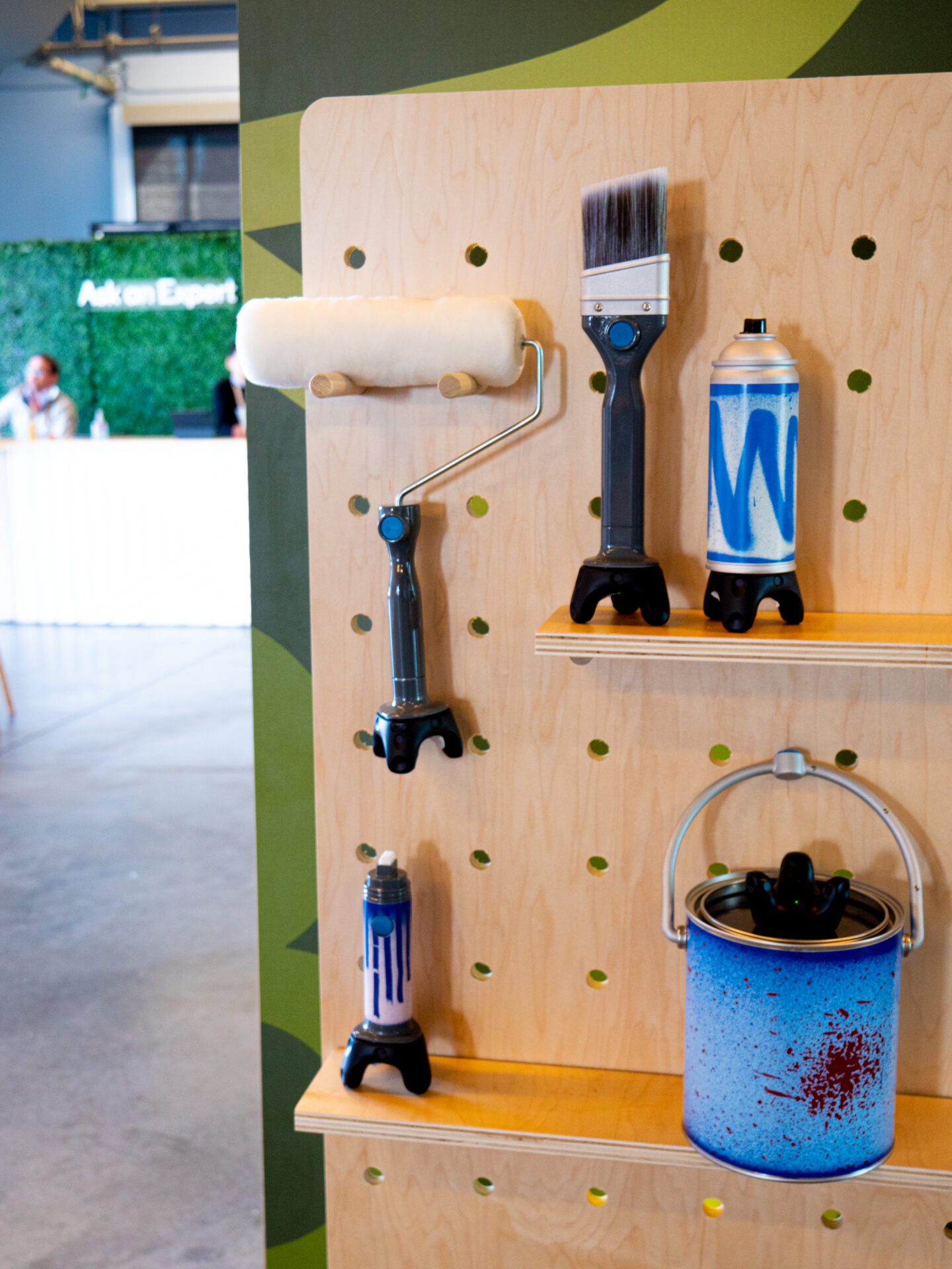
To create a realistic feel of painting, we developed custom made hardware to mount onto the trackers, paintbrushes, markers, paint buckets and paint rollers.
We attached the Vive trackers to our paint tools to give it more functionality: start and stop drawing, ability to switch colors and give it a realistic feel: just like you have to push the button on a graffiti can to start spraying, you would have to push the button on our graffiti can to activate the tracker. We also mimicked the behavior of the painting tools in our software, based on your position to the screen; for the spray can, when you start close it will have thinner strokes than when you stand further away, which makes it really intuitive.
Wheatpaste Walls
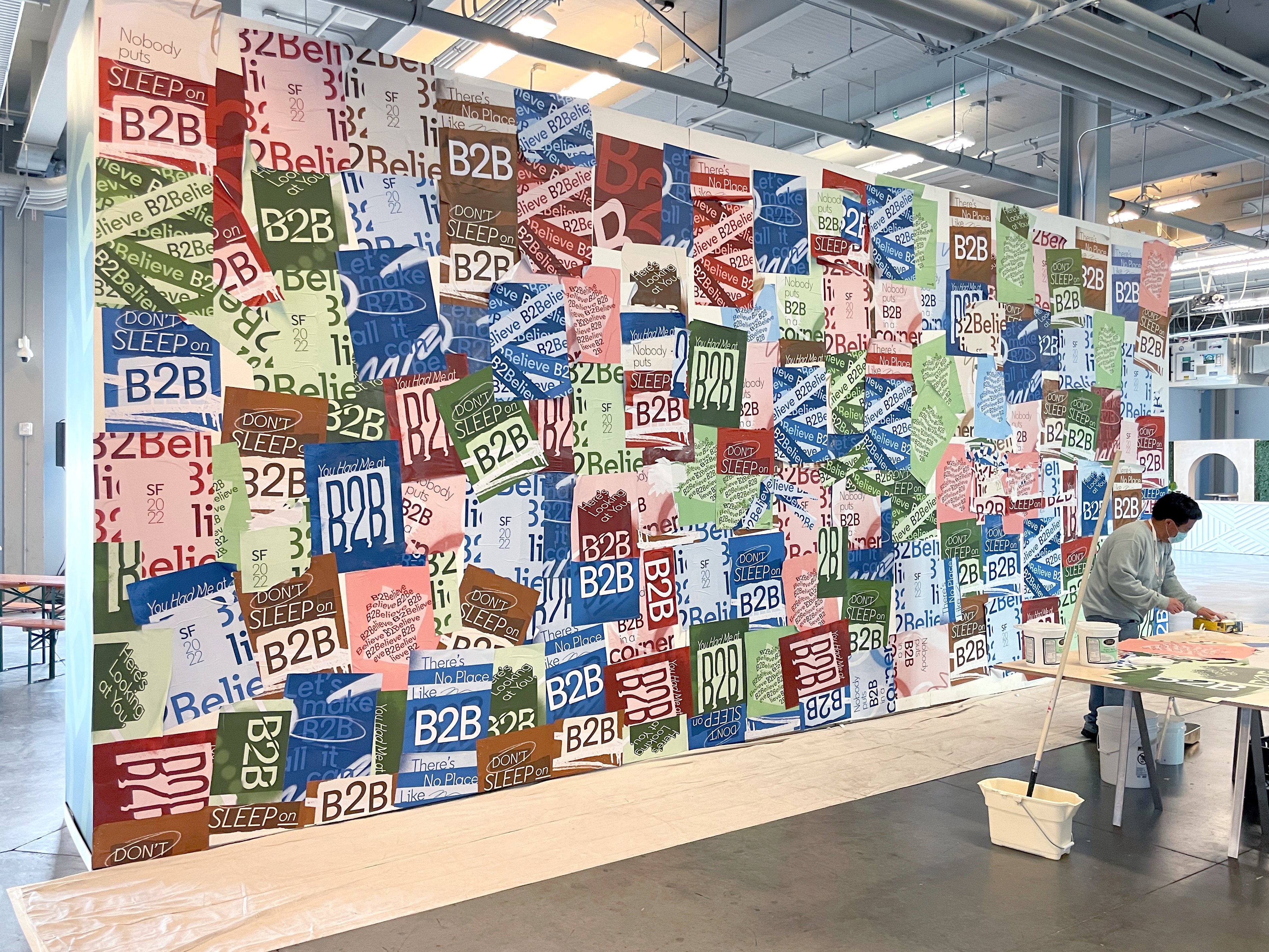
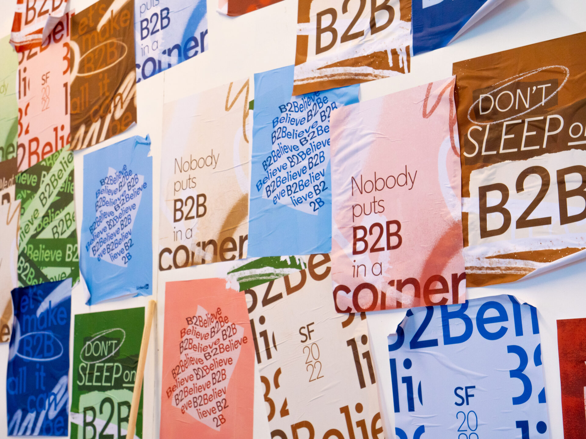
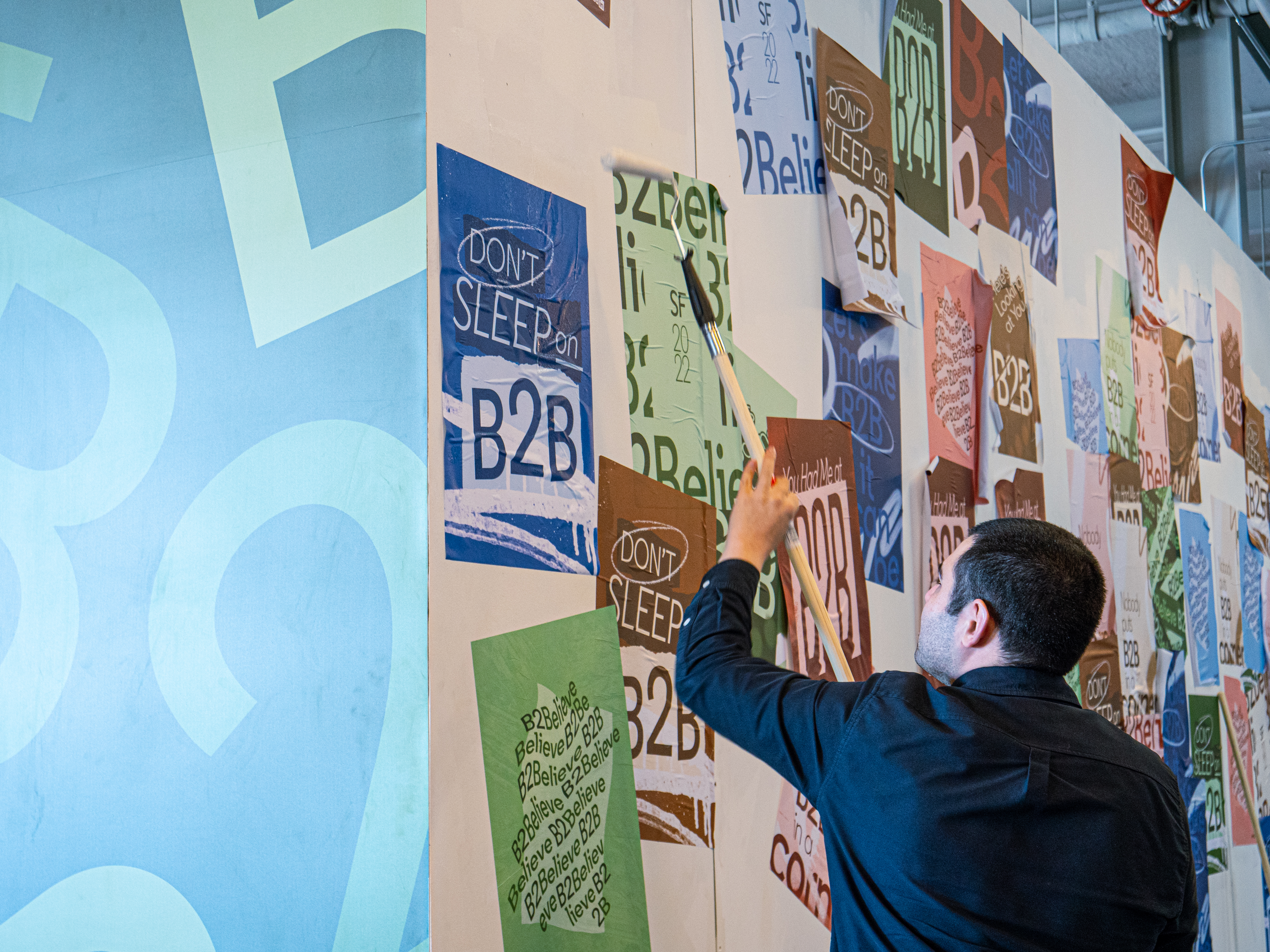
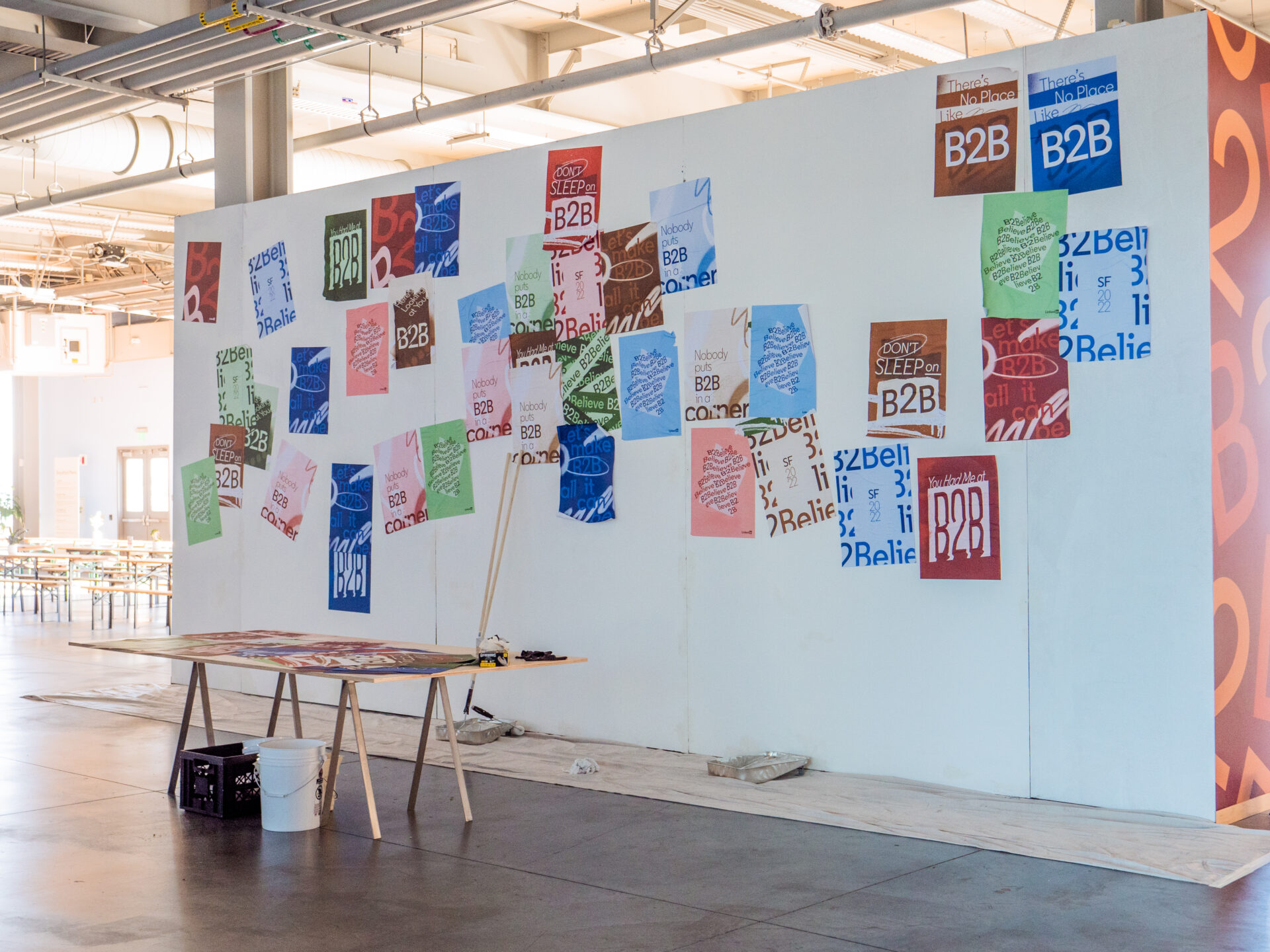
Flanking the digital display on both sides were two wheat pasting walls. A collection of B2Believe inspired posters were designed for the experience in a variety of colors. Using traditional wheat pasting techniques attendees contributed to a couple massive pieces of analog art working as a counterpoint to the digital board.
The Partner Party
An Evening To Remember
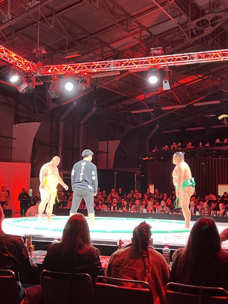
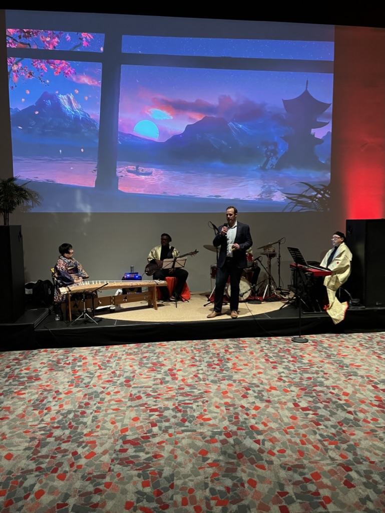
On the 2nd night, LinkedIn hosted a party for Partner Connect attendees. Intended to be fun, inspiring and bring the Partner community together, the event was held at the Palace of Fine Arts in SF. A beautiful space where we hosted a Japanese inspired event that started with cocktails and a live band and then finished with a special Sushi + Sumo event.
