There’s a power, an elegance, and an electric intensity to the TRON Legacy franchise. The narrative of the TRON world itself integrates the tactile human experience with another realm where data, design, stunning architecture, and mood combine for a thrilling ride through a digital plane.
There’s a personal connection Munky has to the franchise. He spent a year designing the holographic world of the film, contributed to high-level concepts for the video game, and now the key visual and live-action campaign for the Lightcycle Run attraction at Magic Kingdom.
What was exciting for him is to be there along the whole collaborative and evolutionary arc of the TRON world. A new favorite agency Disney Yellow Shoes wrote a very cool script focused on typography and pacing, and brought Munkowitz into the fold to apply his aesthetic to the entire package.
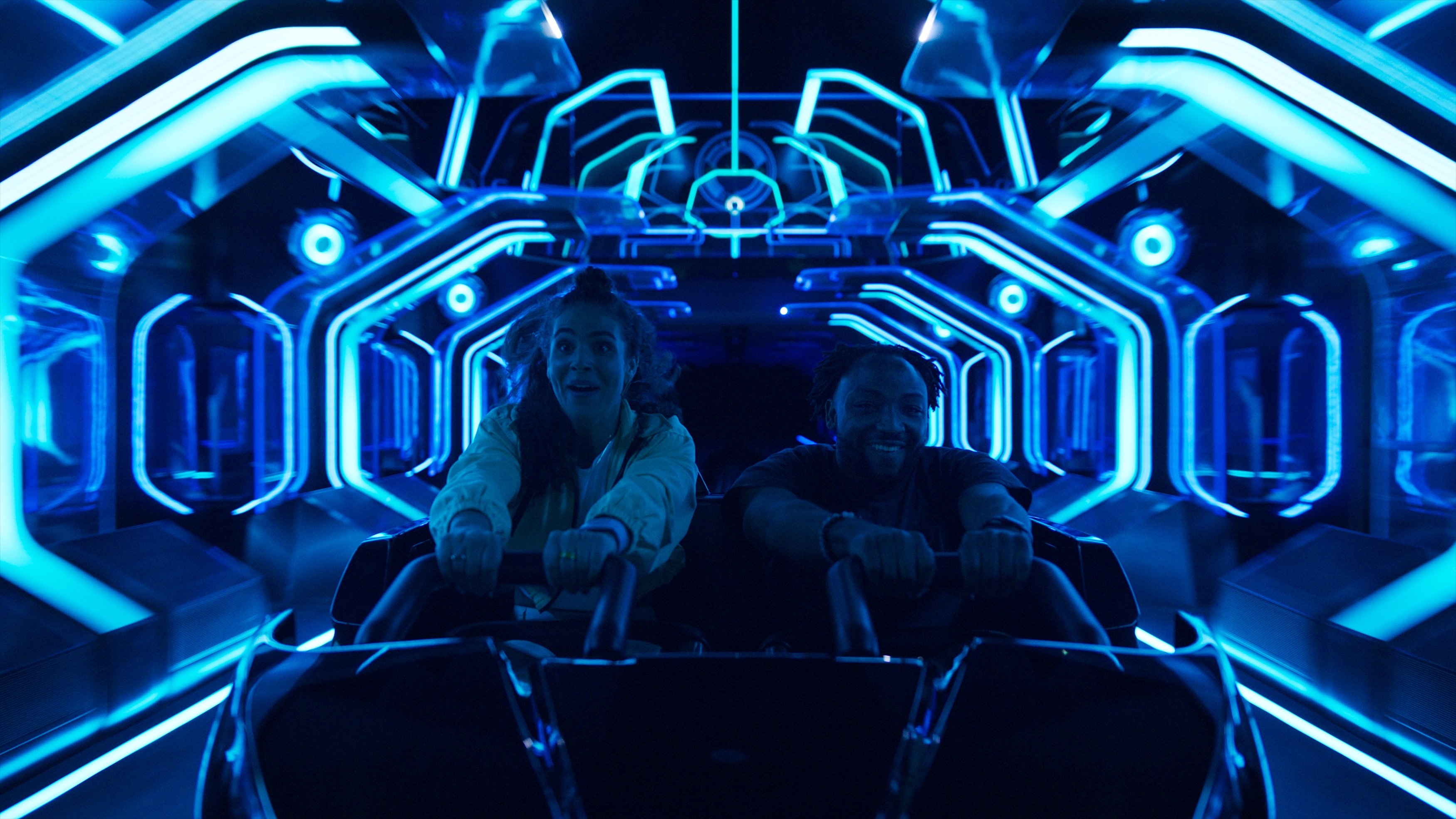
This point in the journey, particularly, really got him excited because it was truly the most cathartic and fully fleshed out manifestation of the story at immense scale and physicality; the characters, the environment, and the concept in an immersive experience that culminated in a total thrill ride.
To see the ride at scale and to strategize how to capture it was a fresh challenge. Combining that with the primary focus of telling the human story behind the experience, achieved through the same lens and focus on the stylistic flair of the existing franchise was an absolute treat to work on.
The Concept
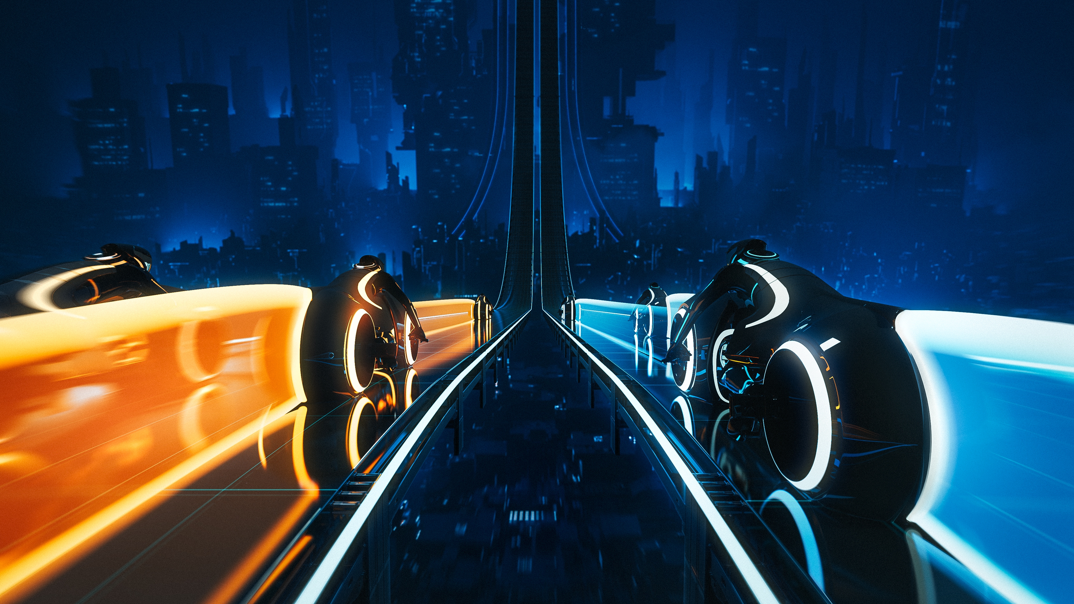
As intricate and as wildly imaginative as it is, there was a very direct and elegant approach to this campaign that embraced the drama, the color, the energy, and iconic status of TRON.
The team had a real opportunity to up the ante through their lensing, framing, and of course the way they spun light and sculpted a visual style. It certainly heightened and elevated the status quo ride film, which was the ultimate goal from the outset.
There’s that unspoken, uncanny emotion you feel when you see those humming light trails blast across the darkness of the grid. It’s beyond just buying a ticket and taking a ride. It’s beyond going to the movies. It’s that tingling sensation you get when you see the iconic TRON typeface, or the helmets, the suits, the digital buzz of the identity disc.
Story is all about character and our characters here were not only the riders but the ride itself. TRON; the colors, the mood, the icon is a core character if not the leading character in this film.
It speaks to this spirit in you that has an expansive and infinite capacity for imagination - it just needs the right keys to the right vehicle to fully unlock it.
This ride, this film, is that key and that vehicle.
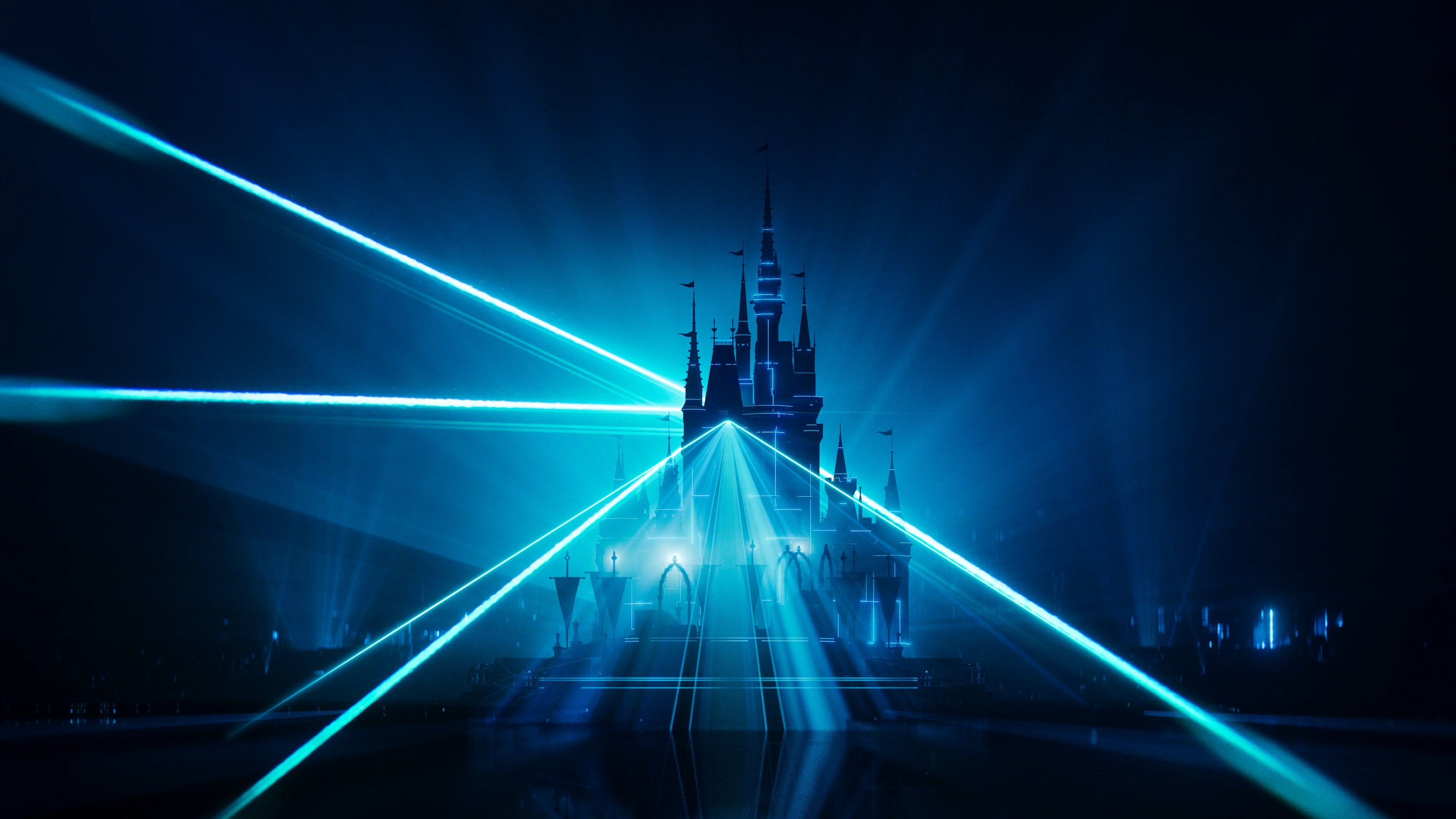
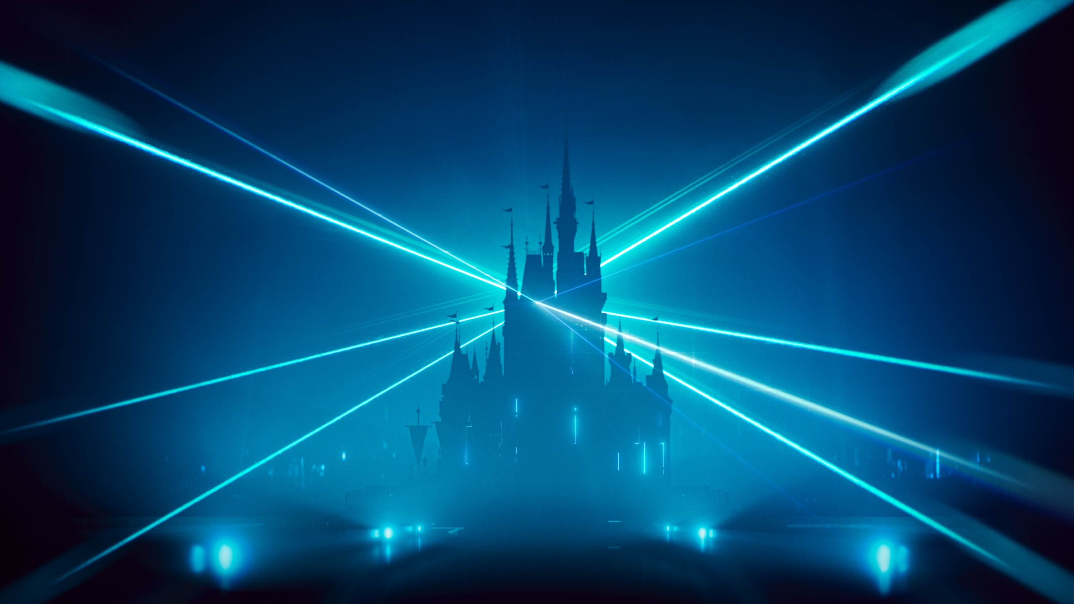
Key Visuals
In addition, a central part of the campaign was to design and craft the key visuals for the ride’s promotion. This set of visuals was used as a bold and graphic documentation of the world itself, an embrace of the drama, the color, the energy, and iconic status of TRON. The goal was to capture and embrace the experience of the ride and translate it into a more stylized palette fixated on copious amounts of flair.

For this task, Munky collaborated with Motion Design legend Mr. Michael Rigley and together they went to town and imagining a diverse set of world-building that served as a strong continuation of their previous works within the TRON sphere.